Sep 14, 2023, 9:00 AM
Putting your charity on the map
By Dr Diego Arenas and Nicole Holgate, DataKind UK
How mapping can improve your mission
Maps are one of oldest and most instantly recognisable forms of data, used for plotting distance, representing geographical features and landmarks and interpreting other information across geographies. From scrolls showing trade routes to modern weather forecasting, they are an incredibly effective way to share information.
For charities, mapping is a way to look at your services with a bird's eye view, in a way that needs less translation and can be more accessible than a written report. It can support fundraising; provide an overview of how your outreach is distributed; evidence where services have the greatest impact; and reveal how you could streamline your operations or resources. For example, mapping out where your service users are can be a huge time and money saving exercise.
In this article we share some examples of how mapping can help charities increase their effectiveness.
How mapping can benefit your charity
- Finding those in need
Where are the people who use your support? Could you expand your outreach, or provide additional support to reach other areas? A visual representation of where you operate can provide an understanding of the local area and the people who live in it, helping to identify areas of greatest need. It can also highlight the need for more services in areas you may not have considered.
The Index of Multiple Deprivation, for example, provides a number of indices for vulnerability, such as poverty. Overlay a map of people you currently support with data from the Index and you can see whether you are effectively finding the people you want to help, or missing key places. The comparison heatmaps created by Citizens Advice Lewisham, for example, were really effective in helping them to check that they were reaching those who might need their support.
- Developing your knowledge of your audience
You can gain a deeper understanding of service users by adding more layers of information, such as whether people living more than three miles from your hub tend to drive to your services, and have the most questions about child development. This can evolve into more complex analysis to predict and distribute future services by looking at patterns over time, such as seasonal increases in needs for childcare, heating, or food parcels. In the case study at the bottom of this article, Material Focus combined information about distance from recycling points with demographic information to learn about who was most likely to recycle.
- Targeting and allocating resources
Mapping use and distribution of resources within your services will show you what different parts of your area of operations use more or less of. This kind of analysis can help you to plan and allocate limited resources, or identify where and how best to distribute them. Do certain hubs use different resources than others? Are some being under-used, or are some areas not receiving enough of the right support?
- Understanding your area
Mapping can also help charities to better understand the local environment, infrastructure and vulnerable populations. Often, local government socio-economic surveys contain a geographic component that can be mapped, to understand the needs of the communities living in a given area or neighbourhood. This can help you to identify under-served demographics, or key groups you might not be reaching.
- Developing relationships
Visualising all of the evidence about the need in your area versus the services provided can help your organisation to build better relationships with local partners and agencies, giving them a more complete picture. This can be key to a holistic approach that benefits a whole community – it also reinforces requests for resources and more support. Based in the London borough of Hammersmith & Fulham, Sobus highlighted the number of BAME people using their services to draw more support from other local organisations and fuel engagement with mental health support in the area.
How do I work with data to do this?
You simply need an address to start working with geospatial data. Combined with any other location-based or geo-referenced dataset, you can add layers of value to an analysis. These data sets could include census data, socio-economic surveys and summary statistics from local authorities. You’ll also hear two terms when looking at mapping your data: geospatial and GIS.
Geospatial is the processing of location and geographic data to analyse and understand patterns and trends. Geospatial data is any data that has a geographic component, such as latitude and longitude coordinates, postcodes and addresses. Common examples of geospatial data include GIS, geo-tagged photos and satellite imagery.
GIS stands for geographic information system. It is a computer system used for storing, managing, analysing and visualising geospatial or geographic data. GIS allows users to view, analyse and create visualisations of geographic data, such as using a car satellite navigator with an added ‘layer’ that warns you about busy traffic ahead on your journey.
Managing risk
Risk factors when it comes to geospatial data are usually privacy related – you need to ensure that any individual’s location isn’t explicitly revealed, especially when cross-referencing it with additional information that could help to identify people, such as age or race.
Anonymisation can be done by expanding the area you include to, for instance, groups of 50 households, LSOAs (Lower layer Super Output Areas), or by only using the first half of a postcode. Similarly, latitude and longitude information should be rounded up so that it encompasses larger areas. Be mindful that in a sparsely populated or rural area, a large region could still contain very few people.
Location data such as route-mapping can also be used to identify individuals; for example, if they frequently move between their home address and workplace. In one unusual example, fitness app Strava revealed the locations of military bases. This kind of information is hard to disguise, so careful consideration should be taken of whether it is necessary to use it at all.
In international situations, satellite imagery may reveal sensitive information, such as the location of refugees. Ways to disguise this include removing any latitude and longitude data attached to the images and downsampling them so that they appear coarser.
Another risk is inaccurate data, especially in areas where what you’re recording isn’t captured easily by surveys, local authorities or satellites. Some organisations rely on support on the ground to ensure that their local knowledge is up to date. This manual approach is time and resource-intensive but can be crucial to helping very specific regions.
Case study: Mapping recycling points with Material Focus
Material Focus is an independent not-for-profit that works to improve the rate of electrical recycling in the UK in order to save and reuse valuable resources, as well as limit waste.
They used maps to visualise their existing data, combine it with other data sets and assess what affects recycling rates. They drew from their own records, open data sets of demographic information and locations of recycling points across the UK. This gave them an incredible picture of who recycles the most and where and what could inspire much more electrical recycling across the country.
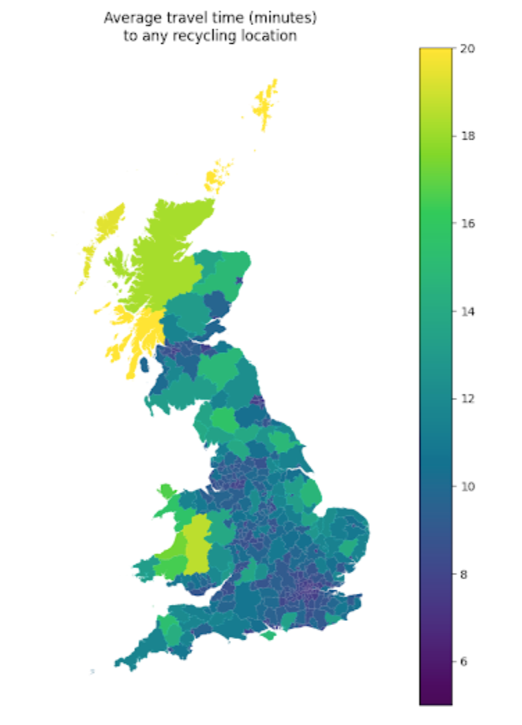
This evidence will help them show local authorities how they can improve recycling levels and how big national retailers can also have an impact by adding more collection points. With an upcoming consultation on government legislation of waste electricals, mapping this data could make a real difference to recycling in the UK.
Tools and Guides
There is a range of free platforms that you can use to map your existing data and combine it with other useful data sets. Here are our top Mapping resources.
If you’d like to learn more from DataKind UK about how your organisation can work with data, please sign up to our mailing list for more news from other charities, resources and articles.
DataKind UK helps social change organisations use data science to have more of an impact by connecting them with some of the UK’s best data scientists for free. Nicole Holgate is Communications Manager at DataKind UK. She has been working as a charity communicator for more than six years, with a background in literature and journalism. Before joining DataKind she worked for homelessness fundraiser Church Homeless Trust, and also volunteers for Sunday Assembly London. Dr Diego Arenas has been a DataKind UK volunteer since 2017 and leads the Scoping and Impact Committee. He holds an engineering doctorate in computer science from the University of St Andrews and is a Senior Researcher in Artificial Intelligence at DFKI. He is passionate about using data science to help the communities they serve.

Fundraising strategy and review
Whatever the size of your organisation, and whatever stage it is at in its ‘life cycle’, our multi-disciplinary team can provide the sector-specific experience you need to understand the market, pinpoint the right opportunities, and develop a cost-effective course of action for maximum return – in the short, medium and long term.
Get in touch
Do you want to hear more about our Fundraising Strategy and Review services? Leave your details below and we'll be in touch.